Archive

Sunrise in a pine forest with Forestry England logo overlaid

Forestry England

I designed a 12 page promotional booklet, folder and information card for the “Feel Good in the Forest’ campaign, seamlessly drawing together elements from their brand guidelines, image library and previous print designs. The result was a delighted set of clients!...

Continue Reading
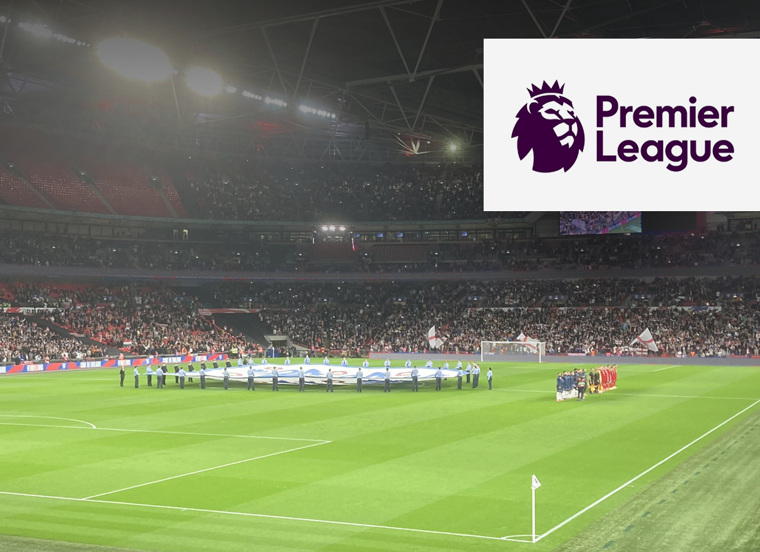
Premier League logo in a white box over an image of an England mens football match at Wembley Stadium, London

Fantasy Premier League

[vc_row][vc_column][qodef_custom_font font_family="Raleway" font_size="24" line_height="34" font_weight="700" letter_spacing="-0.4" text_align="left" content_custom_font="Redesigning the biggest Fantasy Football game in the world." color="#222222"][vc_empty_space height="20px"][vc_column_text]I was the lead designer for this massively popular game (9 million users and counting) from my complete redesign in 2015 to the brand update I implemented in 2019/20.   In phase 1 of this job I simultaneously worked out how to interpret the Premier League's visual rebrand, move the framework from a static to a responsive website and improve the UX at the same time! Then in 2019 I was tasked with interpreting the Premier League's brand refresh to apply to the Fantasy game. I created a pattern library approach to scrutinise and test each key UI component in the browser. Only then did we build out the refreshed page designs.[/vc_column_text][/vc_column][/vc_row][vc_row][vc_column][vc_empty_space height="30px"][/vc_column][/vc_row][vc_row][vc_column][qodef_button size="small" type="outline" target="_self" icon_pack="font_awesome" fa_icon="fa-angle-right" font_weight="" text="View the case study" link="https://goldcrestdesign.co.uk/?page_id=3185"][/vc_column][/vc_row]...

Continue Reading
Full English breakfast with sausages, bacon, fried eggs, beans, toast and coffee on wooden table, top view. Rustic style

British Cornershop

[vc_row][vc_column][qodef_custom_font font_family="Raleway" font_size="24" line_height="34" font_weight="700" letter_spacing="-0.4" text_align="left" content_custom_font="You name it, I designed it!" color="#222222"][vc_empty_space height="20px"][vc_column_text]While I was the incumbent designer for British Corner Shop I created web page designs, animated banner campaigns, HTML emails, corporate presentations, posters, leaflets, stationery, large office wall graphics and display banners.   This is a client who have called on pretty much my full range of ability and experience in the design industry whilst trusting me to maintain their brand integrity across all these varied points of contact.   I was able to really show my versatility as a designer with British Cornershop - a company that have remained number one in their field of 'Exporting British Happiness'.   Please note: I am no longer responsible for any of the visual content of this website.[/vc_column_text][/vc_column][/vc_row]...

Continue Reading

Young woman carries her shopping bags through a busy city centre at night

Connect CMS

[vc_row][vc_column][qodef_custom_font font_family="Raleway" font_size="24" line_height="34" font_weight="700" letter_spacing="-0.4" text_align="left" content_custom_font="Improving the usability and visual appeal of an established CMS" color="#222222"][vc_empty_space height="20px"][vc_column_text]While I worked at a company called Connect IB (now Smartspace), I completely redesigned the front-end functionality of their bespoke CMS. It had been in use (and in continuous development) since 2002 and is at the heart of CIB's business so I faced a big challenge in redesigning it.   I rethought the way sections were grouped and functionality was ordered to simplify key processes. In doing so I kept in mind the everyday users who may not be technically minded and for whom content managing websites is just one of many different tasks they have to perform.   I introduced concise instructional copy, inline tips and user-friendly feedback messaging. Having captured all that with high-end wireframes, I then went on to design a fresh new user interface for the system. You can view the prototype...

Continue Reading

JJFox

[vc_row][vc_column][qodef_custom_font font_family="Raleway" font_size="24" line_height="34" font_weight="700" letter_spacing="-0.4" text_align="left" content_custom_font="A concept to be proud of" color="#222222"][vc_empty_space height="20px"][vc_column_text]JJ Fox are one of the leading providers of education recruitment services in the UK and had put out a tender to redesign their website. This is one of the concepts I proposed for this project which is still a favourite of mine, despite the fact that it wasn't the one ultimately chosen.[/vc_column_text][/vc_column][/vc_row]...

Continue Reading

Fantasy Football UK logo in a white box over an image of a football match in Thailand

Fantasy Football UK

[vc_row][vc_column][qodef_custom_font font_family="Raleway" font_size="24" line_height="34" font_weight="700" letter_spacing="-0.4" text_align="left" content_custom_font="Bringing English Fantasy Football to the Far East" color="#222222"][vc_empty_space height="20px"][vc_column_text]I was commissioned to design a new fantasy football manager game aimed primarily at the Malaysian and Chinese markets. I was solely responsible for the entire concept and design execution of this project including content and user journey planning, information architecture, all copywriting, UI and UX design. It is currently in build - a process I am overseeing for quality control.[/vc_column_text][vc_empty_space height="20px"][vc_column_text][qodef_button size="small" type="outline" text="View the case study" custom_class="" icon_pack="font_awesome" fa_icon="fa-angle-right" link="https://goldcrestdesign.co.uk/?page_id=3472" target="_self" color="" hover_color="" background_color="" hover_background_color="" border_color="" hover_border_color="" font_size="" font_weight="" margin=""][/vc_column_text][/vc_column][/vc_row]...

Continue Reading

Briarwood Products

[vc_row][vc_column][qodef_custom_font font_family="Raleway" font_size="24" line_height="34" font_weight="700" letter_spacing="-0.4" text_align="left" content_custom_font="Promoting a British Family Farming Business" color="#222222"][vc_empty_space height="20px"][vc_column_text]I have been building a trusted relatonship with The UK’s leading supplier of fibre cement profiled sheets since 2018. In that time I have designed a large range of product information sheets, trade stand graphics, press ads, posters and corporate stationery. I also did all the image retouching and technical illustration for the information sheets, always maintaining a consistent house style.[/vc_column_text][/vc_column][/vc_row]...

Continue Reading

Equiti logo in a white box over an image of a female scientist looking into a microscope in a busy research lab

Equiti

[vc_row][vc_column][qodef_custom_font font_family="Raleway" font_size="24" line_height="34" font_weight="700" letter_spacing="-0.4" text_align="left" content_custom_font="Bringing complex data alive" color="#222222"][vc_empty_space height="20px"][vc_column_text]Equiti is a leading provider of financial market news, research, tools and analysis. They needed to provide their clients with a new tool to help them monitor the worldwide effect of the COVID 19 pandemic on their currency trading. I created a dashboard that presents the various data feeds in a neatly sectioned and clearly presented visual language that is also bang on-brand.[/vc_column_text][/vc_column][/vc_row]...

Continue Reading

The Physical Edge Gym Chain

[vc_row][vc_column][qodef_custom_font font_family="Raleway" font_size="24" line_height="34" font_weight="700" letter_spacing="-0.4" text_align="left" content_custom_font="Fit for Purpose" color="#222222"][vc_empty_space height="20px"][vc_column_text]Having created the branding for The Physical Edge - a new fitness facility chain, I went on to design their website and a full suite of marketing materials. These included; Leaflets, posters, business cards, pull-up banners, signage, press ads and online ads.[/vc_column_text][/vc_column][/vc_row]...

Continue Reading
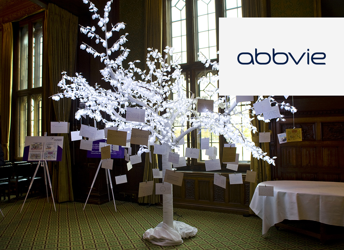
AbbVie

[vc_row][vc_column][qodef_custom_font font_family="Raleway" font_size="24" line_height="34" font_weight="700" letter_spacing="-0.4" text_align="left" content_custom_font="Raising awareness of the life impacts of psoriasis" color="#222222"][vc_empty_space height="20px"][vc_column_text]The Psoriasis Association and the The Mental Health Foundation partnered on the See Psoriasis: Look Deeper campaign, to raise awareness of the impact that psoriasis can have on a person’s quality of life, mental and emotional wellbeing. I was asked by AbbVie, the main sponsor of the project to come up with the branding for the campaign and to follow that with the design of a range of promotional items.[/vc_column_text][/vc_column][/vc_row]...

Continue Reading